Tata Advanced Systems Logo
Our Visual Identity
Our visual identity comprises of two elements, the Tata Group Composite Mark and the Tata Advanced Systems Mark or the Company Mark.
The Tata Group Composite Mark and Tata Advanced Systems Marks are always to be used in conjunction with each other.
The T height in both the Marks is to be the same, except in exceptional cases on approval from the Corporate Communications Team.

Tata Group Composite Mark and the Tata Advanced Systems Mark
The Tata Group Composite Mark represents the group as a whole – a symbol for everything that is part of Tata. It is also used to support the Company Mark.
The Tata Advanced Systems Mark represents Tata Advanced Systems, a fully owned subsidiary of Tata Sons. It is used in conjunction with the Tata Mark on an application.
Please note that the Tata Advanced Systems Marktype is an image and not text and should always be reproduced from an approved artwork or authorised data files.
Relationship Between Marks
The two marks can appear stacked, which is the preferred placement, or linear, by the side of one another.
Center Aligned – Stacked (Preferred)
Bottom Aligned – Linear (Alternative)
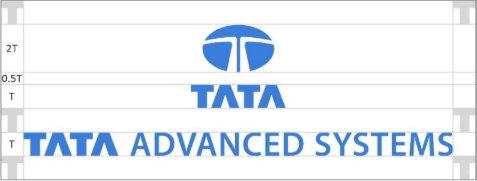
Exclusion zone
The logo must always be surrounded by clear space to maintain its impact and importance.
The line around the mark (equivalent to the size of the letter ‘T’) indicates the minimum exclusion zone into which nothing should intrude.
This zone has been designed to ensure that the mark never appears cluttered by other graphic elements.
It is important to keep this zone around the logo clear of any graphic elements or too busy backgrounds, or backgrounds with too much contrast which would make the logo illegible.
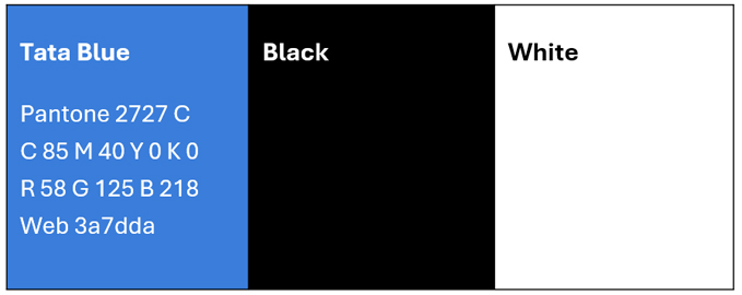
Colour Rationale
The preferred colour for the visual identity is ‘Tata Blue’ on a white background.
Where Tata Blue is not available, for example on laser printed documents and black and white advertisements, it may appear in black only.
Where appropriate, it may appear in white on a background of Tata Blue.
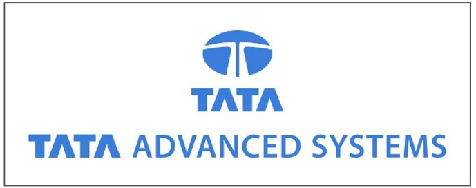
Logo Variants
Blue on White Variant
The Blue on White variant is to prioritised whenever possible.
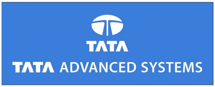
White on Blue Variant
For greater flexibility
Black on White Variant
For display on light background

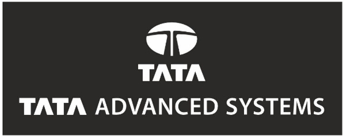
White on Black Variant
For display on dark background
By clicking "Accept" or continuing to use our site, you agree to our Website's Privacy Policy
© 2026 Tata Advanced Systems Limited All Rights Reserved